Kessaku: A Journey to the Clouds
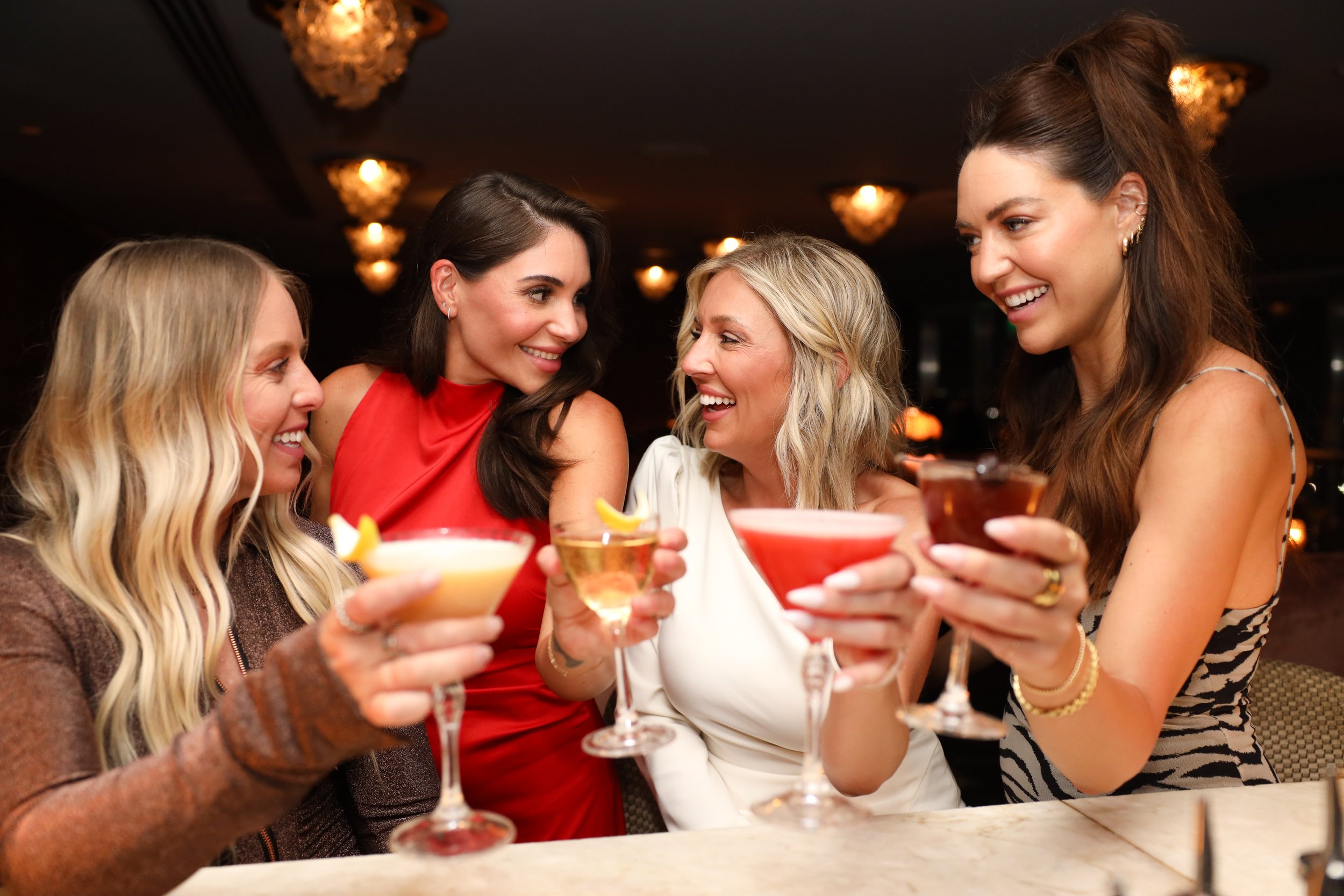
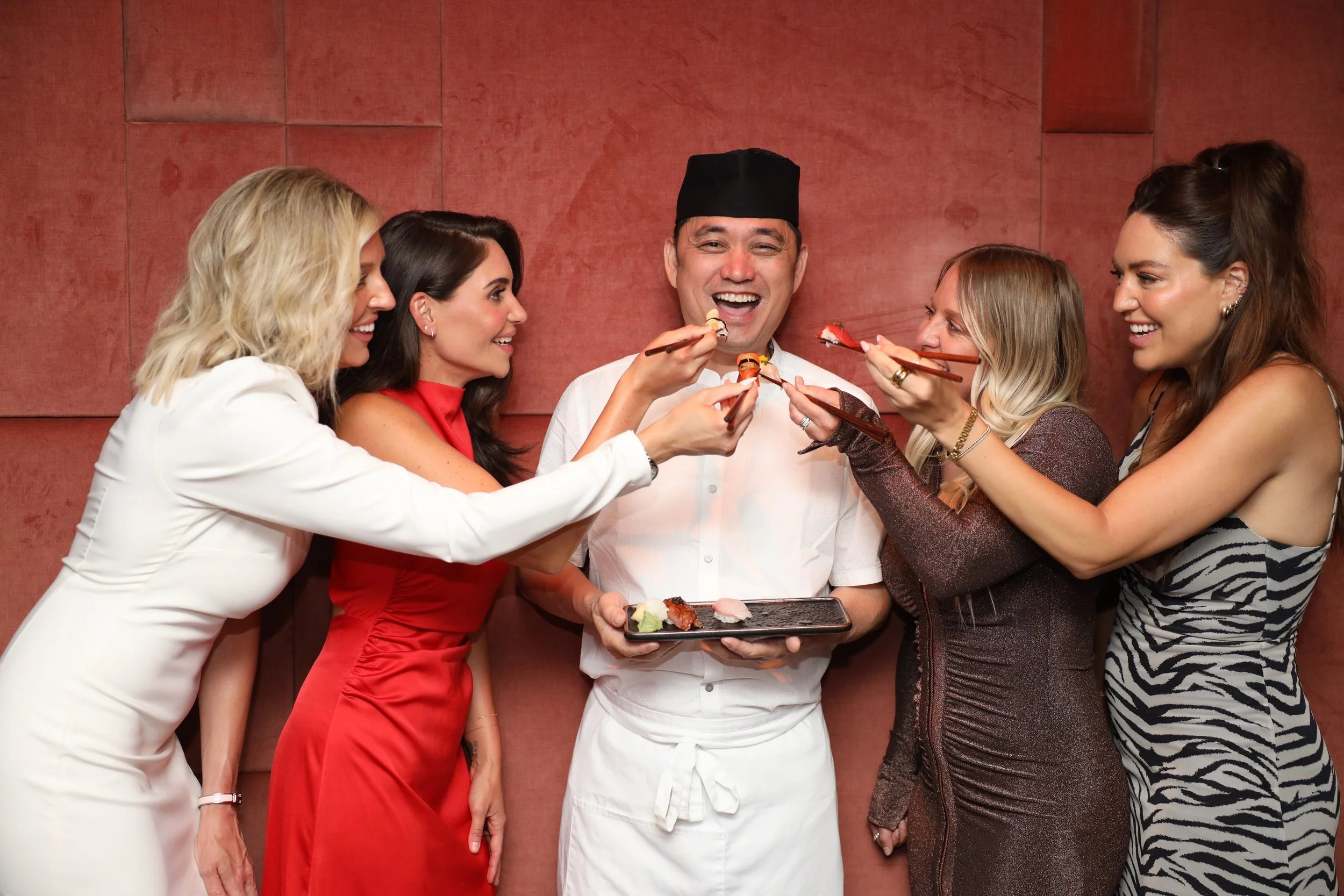
Kessaku, a luxury bar and sushi restaurant, is perched high above the Dallas skyline, offering breathtaking views and an elevated dining experience. Operated by Maple Hospitality Group, Kessaku was envisioned as a destination for sophisticated cocktails, expertly crafted sushi, and an atmosphere unlike anything else in the city.
However, despite its prime location and stunning offerings, Kessaku faced declining attendance. The brand lacked cohesion between its visual identity and the physical space, leaving guests confused and disconnected. The restaurant’s biggest challenge? Accessibility. Situated downtown, the venue required navigating a labyrinth of elevators and staircases, creating friction for return visits. Maple Hospitality Group brought me in to reimagine Kessaku’s identity and transform these challenges into opportunities.
Background
The goal was to revitalize Kessaku’s brand, aligning it with its upscale, sky-high setting and overcoming logistical hurdles. Guests needed to feel that the effort to reach Kessaku was part of the allure rather than a drawback. Additionally, the outdated visual identity needed to reflect the sleek, modern interiors of the space to provide a seamless and memorable guest experience.
Challenge
PROCESS
To reframe the difficulty of reaching Kessaku, I leaned into the concept of exclusivity and reward. We crafted a brand story centered on the idea that “Nothing wonderful was ever easy to achieve.” Kessaku became the ultimate hidden gem, “tucked in the clouds of Dallas,” with a journey to match its unmatched views and offerings. This narrative positioned Kessaku as an aspirational destination, heightening its appeal for social media-savvy guests seeking unique experiences.
1. Turning Challenges into Strengths
To amplify the buzz around Kessaku, we introduced a Cocktail Omakase program, a one-of-a-kind, interactive menu experience:
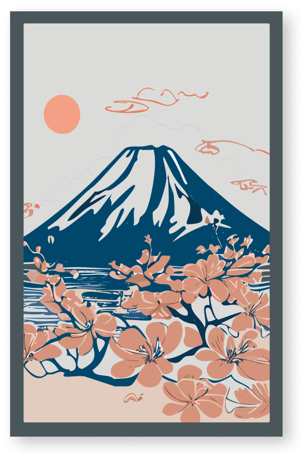
The Mystery Cards: Guests select from beautifully illustrated tarot-style cards featuring imagery tied to Japanese culture.
Personalized Cocktail Reveal: Each card includes a poetic story on the back, such as the “Card of Resilience,” inspired by the cherry blossom’s symbolism in Japanese tradition. The cocktail is then revealed—a cherry blossom-infused masterpiece.
This program created a sense of discovery, exclusivity, and social media buzz, encouraging guests to share their experiences and become ambassadors for the brand.
2. Interactive Guest Experiences
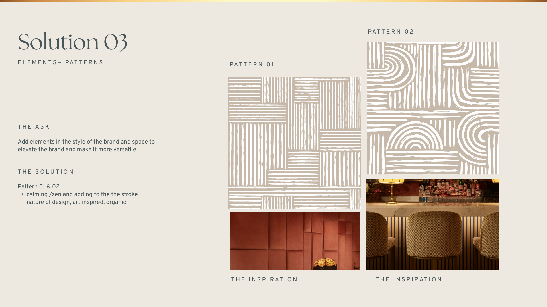
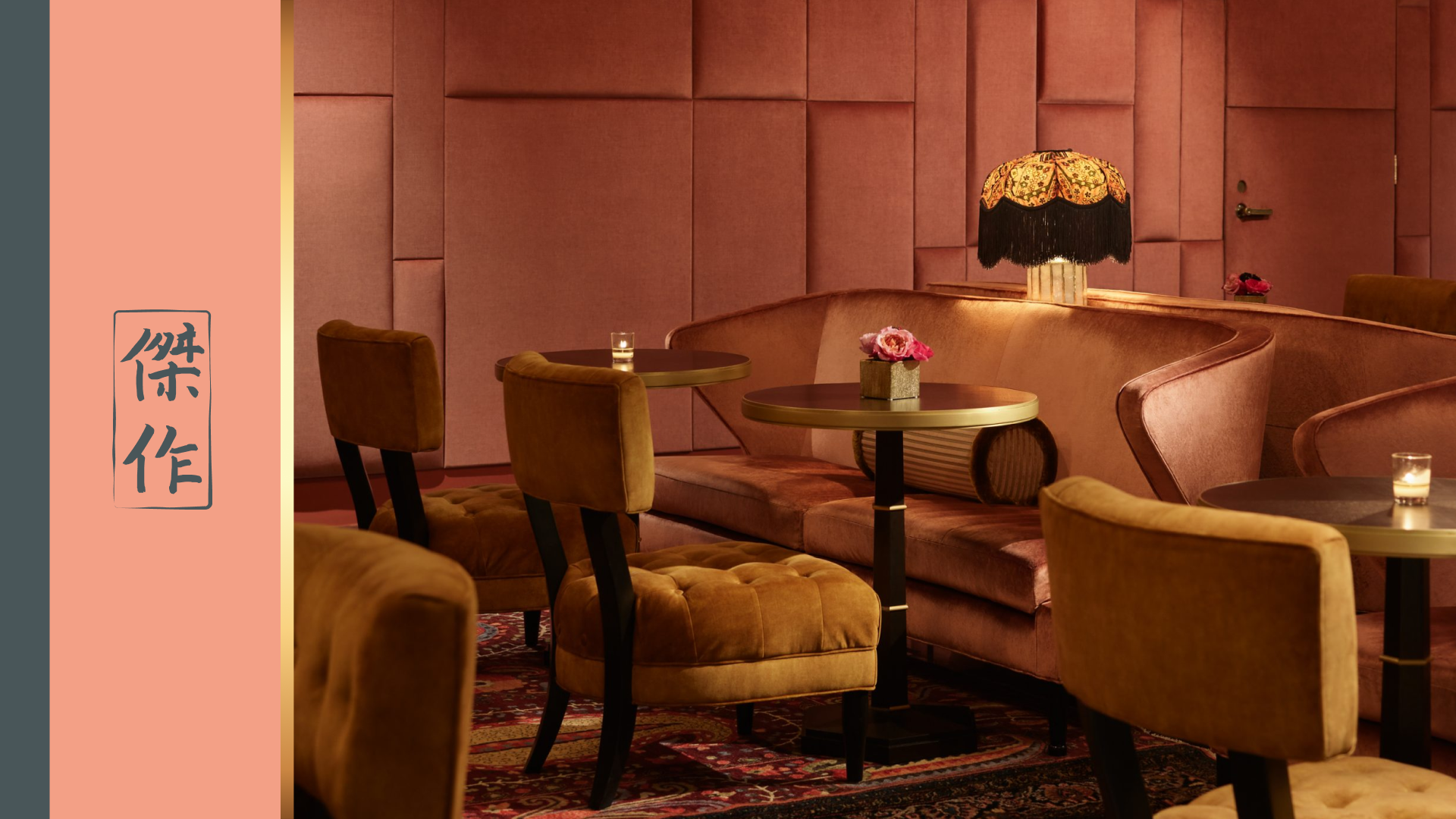
The brand’s visual identity was transformed to match the sophistication of the physical space. Inspired by the restaurant’s modern interiors and breathtaking skyline views, the rebrand included:
Logo and Typography: Minimalist yet bold, reflecting the elegance of the venue.
Color Palette: A refined mix of deep blues, metallic accents, and warm neutrals, mirroring the Dallas skyline at dusk.
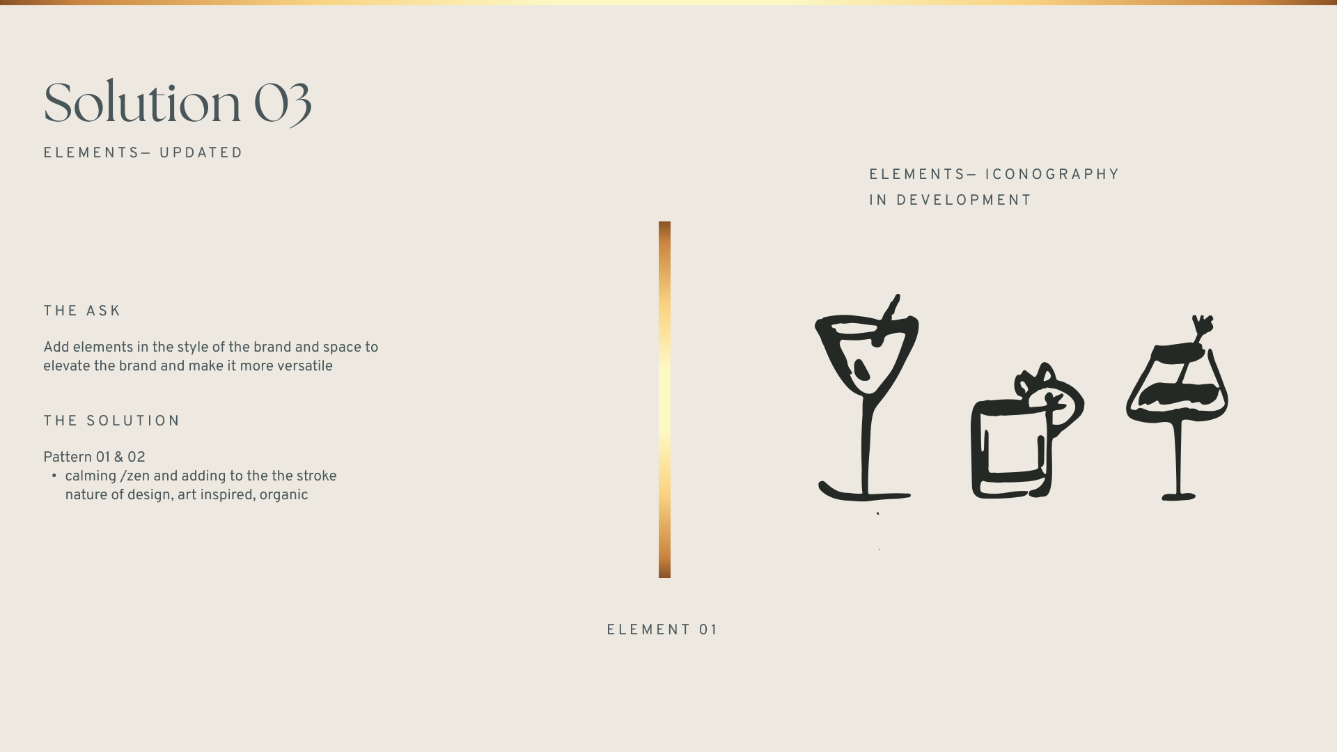
Branded Materials: Menus, packaging, and merchandise were designed to exude luxury while maintaining a cohesive visual language.
3. Visual Identity Overhaul


